TutorNest
App and responsive website
Client
Google UX certificate
Year
2024 (4 months)
Role
End-to-end design
Project overview
The TutorNest app and responsive website allow parents to search for and book tutors for their children.
The product
Parents often struggle to find reliable, qualified tutors for their children, with limited resources for comparing options, availability, and pricing. Current solutions are either too complex or lack the convenience of an easy booking system, making it challenging for parents to secure the right tutor quickly and confidently.
The problem
To design an intuitive app and responsive website that streamline the tutor search and booking process for parents.
TutorNest should allow users to easily find qualified tutors, view availability, compare rates and reviews, and complete bookings with minimal effort, whether on mobile or desktop. The goal is to enhance accessibility, transparency, and efficiency in the tutor booking experience for busy parents.
The goal
My role & responsibilities
I was the sole designer on TutorNest, and led the entire design process:
User research
User persona creation
User journey mapping
Wireframing
Prototyping
UI design
Usability testing
Iteration
Understanding the user
I conducted in-person moderated interviews with parents.
Results showed that users prioritize the ability to easily compare key factors like price, rating, location, and certification when selecting a tutor. This insight led me to design a more streamlined interface that emphasizes these comparison elements, making it easier for users to make informed decisions quickly.
User research summary
User personas are created as fictional representations of our target users to help keep the design focused on their specific needs, behaviors, and goals.
User personas
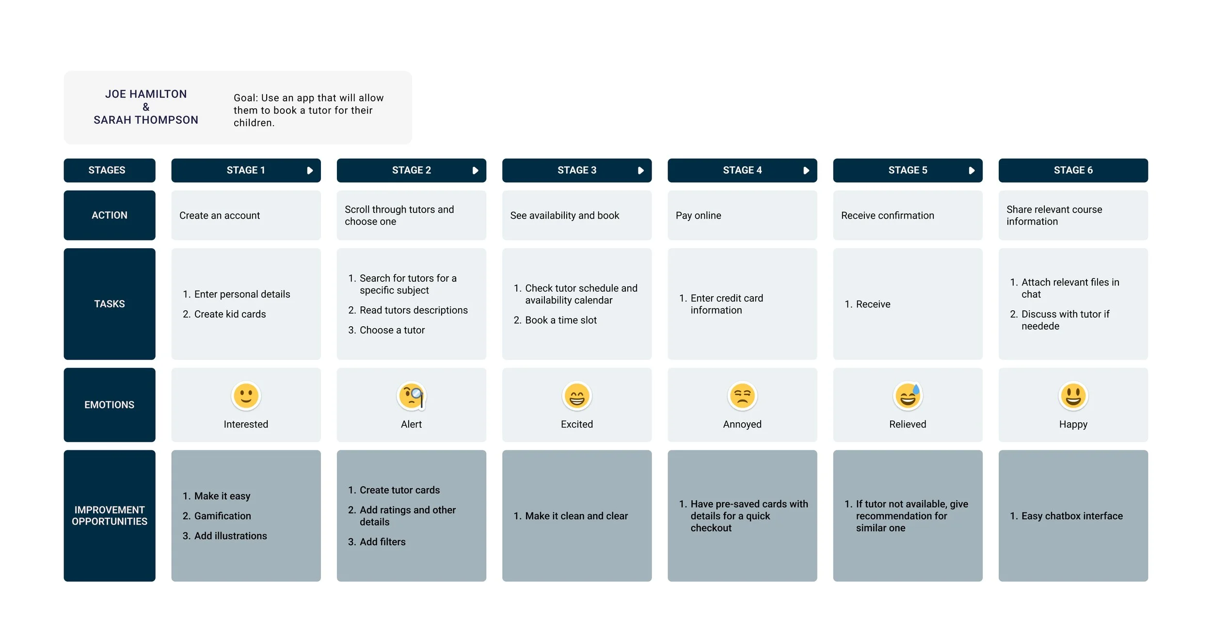
User journey map
Starting the design
Every masterpiece starts as a rough sketch!
Paper wireframes are a quick, low-cost, and easy way to brainstorm and visualize design layouts before moving to digital tools.
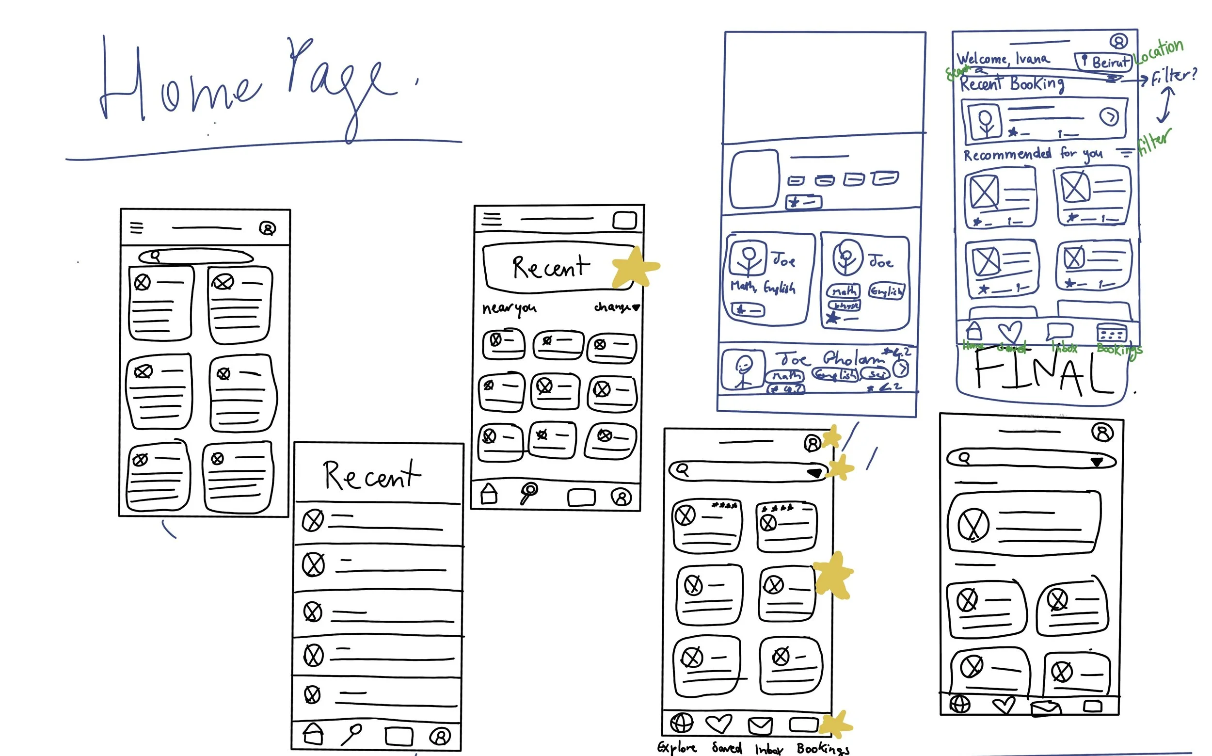
Paper wireframes (app)
While designing my paper wireframes, I designed multiple screens for each page which allowed me to eventually choose the best options that addressed the user pain points. I also brainstormed about which elements should be present within those pages.
I used stars to highlight the designs that would make it to the final draft
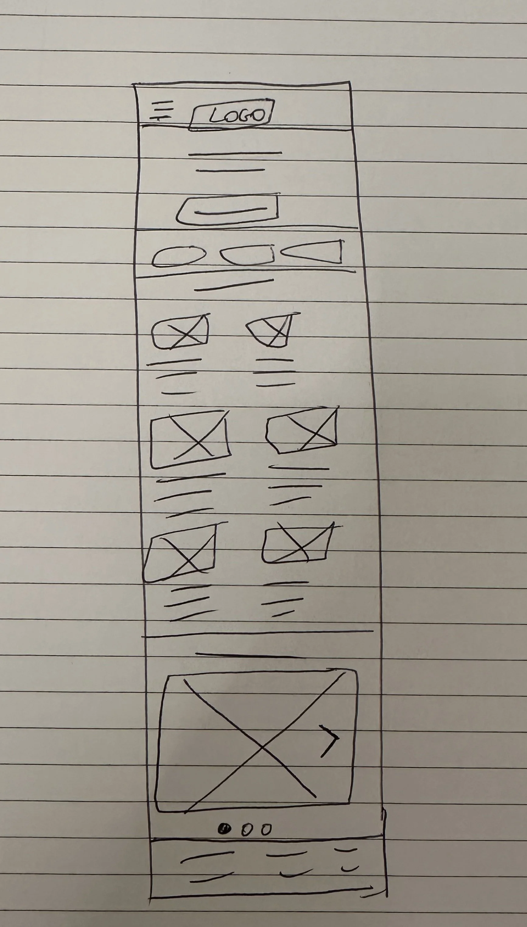
Sitemap & paper wireframes (website)
A sitemap is a visual outline of a website's structure, helping to organize content and ensure smooth navigation for users. Here is the sitemap for the landing page of the website
Here are the paper wireframes for the responsive website. I designed a rough sketch for each page of the website for desktop (left) and for mobile (right).
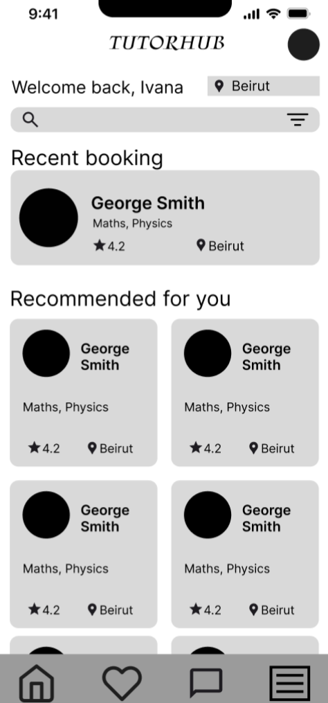
Now it's time to bring the paper wireframe to life in Figma. This allows for prototyping and making it interactive for the first round of usability testing.
Digital wireframes
Tutor rating clearly visible for parents to know which tutors are best.
My goal was to have a clear and structured homepage from which a user can seamlessly flow through and receive all the necessary information
Filters to refine the search based on different needs such as specific date availability or price
Filters are important as user research showed that different users have different needs and values.
For example, the parent of a child with special needs will want to only see tutors who have experience with special care; for a more refined search.
The landing page consists of a hero section and a browsing section so users can have an idea of what kind of users are available
Big call-to-action button to prompt the user to start booking
The same landing page but adapted to another screen size: mobile
Usability study parameters
The research goals were to figure out if the app is easy to use and if users can easily find tutors that would best align with what they are looking for.
Study type
Moderated interview
Participants
4 parents (app)
3 parents (website)
Duration
10 minutes (app)
20 minutes (website)
Location
Beirut, Lebanon. In-person (app)
London, UK. In-person (website)
Usability study findings
Website
Users need a quicker way to access subsections
Users need to be informed of the different options from the beginning
The usability study offered valuable insights into how users interact with the design and their preferences. Here are the key observations and recommendations based on their feedback.
App
users need better cues for what steps to follow to book a tutor
users need a way to remind them of their booked sessions
users need more than just a score for tutor reviews
Refining the design
Based on the finding:
Users need better cues for what steps to follow to book a tutor
Design iterations
After usability study
Before usability study
In the app, I added a call-to-action button on the homepage that says “start booking” and that takes the user to the start of the booking flow. I also added “or browse tutors” as a cue to scroll through tutors as an alternative
Based on the finding
Users need a quicker way to access subsections.
Before usability study
After usability study
In the mobile version of the app, the navigation is accessed through a hamburger menu. I added the three subsection of the “My profile” section, so users can access them directly from the navigation menu, for a faster and seamless interaction
Mockups
App design system
Typography
Colors
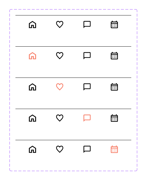
Navigation bar
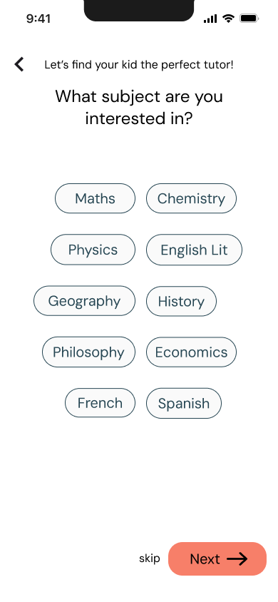
App high-fidelity mockups
Website high-fidelity mockups (desktop)
Website high-fidelity mockups (mobile)
Accessibility considerations
Ensured adequate contrast between text and background to improve readability.
Ensured that content is organized in a clear hierarchical and logical order, which helps users easily navigate and understand the information.
Added descriptive alt text for images to support screen readers.
Takeaway
Product success
The TutorNest platform offers parents a highly effective, convenient solution to connect their children with quality tutoring support tailored to individual needs.
With the growth in demand for personalized learning and accessible online education, this platform could see increasing success by combining flexible scheduling, diverse resources, and skilled tutors to ensure effective learning experiences for young students.
Parents appreciate the control and convenience of being able to choose the right tutor and set schedules that fit family life. By bridging gaps in education access and offering structured yet flexible sessions, TutorNest represents an impactful resource for both academic improvement and developmental support for students.
What I learned
I gained valuable insights into creating user-centric experiences. I learned the importance of understanding user needs, ensuring that every design decision was driven by real-world feedback.
This process highlighted the need for simplicity in navigation and interactions, allowing users to achieve their goals quickly and intuitively.
I also recognized the critical role of accessibility considerations, ensuring that the design was inclusive and usable for all users, regardless of their abilities. Additionally, I balanced aesthetic appeal with functional efficiency, ensuring that the visual design enhanced the overall user experience without compromising usability.
Let’s connect !
for more information or feedback, email me at
mansourivana@gmail.com


